

A Guide to Seasonal Color Analysis
By Shonna Roberts | DAELA Portland & DAELA Academy
Most of us already know that certain colors look better on us than others, even if we have no idea why.
You have the shirt that always seems to work. The lipstick you keep replacing when it runs out. Maybe you’ve tried on two sweaters in exactly the same style and loved one but couldn’t get the other one off fast enough. The fit wasn’t the problem. It was the color.
So, what colors actually look best on you?
That’s where color analysis comes in. Rather than choosing colors based entirely on what you like, what’s trending or what looks great on somebody else, color analysis looks at how different colors work with your own skin, hair and eyes.
And there’s a little more to it than checking the veins on your wrist.
First, Skin Tone and Undertone Aren’t the Same Thing
This is probably the most confusing part of the whole conversation.
Your skin tone is the visible color and depth of your skin. Your undertone describes the underlying color characteristics of your skin and is generally described as warm, cool or neutral. Someone with very fair skin can have warm undertones, while someone with deep skin can have cool undertones. You can’t reliably determine undertone simply by looking at how light or dark someone’s skin is.
You’ve probably seen some of the popular DIY tests. Are your veins blue or green? Do you look better in gold or silver jewelry? Does your skin look pink or yellow next to a white shirt? Those things can offer clues, but they’re not particularly helpful when the answer is, “Well…kind of both.”
That’s where looking at your coloring as a whole becomes more useful.
What Is Seasonal Color Analysis?
Seasonal color analysis is a system for identifying the colors that work well with your natural coloring. The traditional system uses four main color families: Spring, Summer, Autumn and Winter.
At its simplest, Spring and Autumn palettes tend to be warmer, while Summer and Winter tend to be cooler. But temperature is only one part of color.
Color can also be light or deep, bright or muted. Your own features have variations in depth and contrast, too. Modern seasonal color analysis takes these characteristics into consideration rather than trying to determine everything from skin undertone alone.
This is also why two people with warm undertones don’t necessarily look their best in the same colors.
One person may look fantastic in a light, clear coral while another is much better in a deep rust. Both colors are warm. They’re just very different versions of warm.

Spring, Summer, Autumn and Winter: What Do They Mean?
The season names are really just a way of organizing groups of colors with similar characteristics. They aren’t a judgment about your complexion, and being assigned a season doesn’t mean you’re limited to a tiny handful of colors for the rest of your life.
Generally, Spring palettes are warm and clearer or brighter. Think fresh, warm colors rather than heavy or muted ones.
Summer palettes are cool and softer. The colors tend to have a more muted quality rather than being extremely saturated.
Autumn palettes are warm and often richer, deeper or more muted. This is where you’ll see many of the earthy colors people typically associate with fall.
Winter palettes are cool and tend to handle clearer, deeper or higher-contrast colors well.
There are also expanded seasonal systems that divide those four categories into more specific sub-seasons because human coloring obviously doesn’t fit neatly into four boxes. The season is useful, but understanding why you’re in that season is much more useful.

Why Does One Blue Look Great on Me and Another One Doesn’t?
This is the part of color analysis I find the most interesting.
People often think in terms of individual colors: I can’t wear yellow. I look good in green. Red looks terrible on me.
But “red” isn’t really one color.
There’s tomato red, brick red, cherry red, burgundy, coral red and blue-based red. There are bright reds, muted reds, light reds and very deep reds. The same thing happens with blue, green, pink and just about every other color.
So you may not look bad in yellow. You may look bad in that particular yellow.
Once you understand whether you’re generally complemented by warmer or cooler colors, softer or clearer colors, and lighter or deeper colors, shopping starts to make a lot more sense.
You don’t necessarily need to stop wearing anything. You just get better at choosing the version of a color that works with you.

How Do I Know What Colors Look Best on Me?
You can absolutely experiment at home.
Start with a clean face in good natural light and pull a few noticeably different colors from your closet. Hold them near your face rather than looking at the entire outfit in a mirror.
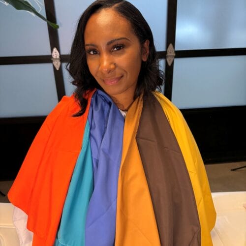
Try comparing colors instead of evaluating them individually. A warm cream next to a bright white is more informative than looking at cream by itself. Try a warm rust against a cool berry color, a muted blue against a bright cobalt, or a soft neutral against black.
Then pay attention to your face, not the fabric.
Does one color make your complexion appear more even? Do your eyes become more noticeable? Does another seem to emphasize redness or shadows? Does your eye immediately go to the shirt instead of your face?
Comparison is important because color is relative. It’s much easier to see what a color is doing when you have something else beside it to compare.
Why Online Skin Tone and Color Season Quizzes Can Get Confusing
If you’ve already taken three “What’s my color season?” quizzes and gotten three different answers, I understand why you’d start questioning the whole thing.
Online tests have limitations.
A quiz can only work with the answers you give it, and some of those answers are surprisingly hard to determine yourself. If you’re trying to figure out whether your skin is warm or cool because you don’t already know, answering a question asking whether your skin is warm or cool doesn’t get you very far.
Photos create another problem. Lighting, your phone camera, makeup, hair color and image processing can all affect the colors you’re seeing on a screen.
That doesn’t mean online color analysis is useless. It can be fun, and it can give you a starting point. I just wouldn’t throw out half your closet because an app told you that you’re an Autumn.
What Does a Professional Seasonal Color Analysis Do Differently?
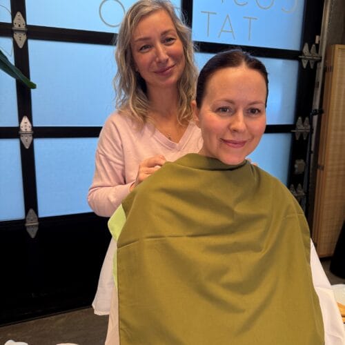
An in-person color analysis lets us compare colors directly against you rather than interpreting a photograph.
We can look at your skin tone and undertone along with your hair, eyes and overall coloring, then compare different colors to see what actually happens. Instead of trying to force an answer from one characteristic, we’re looking for patterns.
Maybe you can handle warmth but very muted colors make you disappear. Maybe you’re relatively neutral and the bigger factor is how much depth you can carry. Maybe the difference between two shades is obvious the second they’re placed next to your face.
Those distinctions are difficult to communicate with a quiz because they’re visual.
A professional analysis also shouldn’t leave you with nothing more than, “You’re a Summer. Bye.”
The useful part is understanding what that means when you’re standing in a store holding two sweaters.
Color Analysis Goes Beyond Your Closet
Once you understand your coloring, you start seeing the same principles everywhere.
Lipstick is a great example. Two reds can look nearly identical in the tube but very different once they’re on a person. The same applies to blush, eyeshadow and other makeup colors.
Hair color is another big one. Warm versus cool, light versus deep and soft versus bright can completely change how a hair color works with someone’s complexion.
Then there are glasses, jewelry and accessories. Even the neutrals you build your wardrobe around—black, white, cream, brown, gray, navy—have different temperatures and depths.
This is why I think knowing your colors is more useful than simply being handed a list of “approved” clothing colors. You’re learning something you can apply in a lot of different places.

Do I Have to Stop Wearing Colors That Aren’t in My Season?
Absolutely not.
I would actually hate color analysis if that were the point.
If you love neon green and your analysis says neon green isn’t technically your most flattering color, please wear the neon green. Personal style should still be personal.
Knowing your colors simply gives you information. You might use it when you’re buying an expensive coat you’ll own for ten years, choosing a lipstick, changing your hair color or deciding between four nearly identical shirts.
There are also plenty of ways to wear a favorite color that isn’t ideal next to your face. Pants, shoes, bags, prints and accessories don’t interact with your complexion in quite the same way as a shirt or scarf sitting directly underneath it.
Color analysis should make getting dressed easier, not give you another set of rules to worry about.
Why I’m Bringing Seasonal Color Analysis to DAELA Portland
Color analysis may be a new service for me, but color itself definitely isn’t.
My primary work at DAELA Portland is paramedical tattooing, particularly scar and stretch mark camouflage. Color theory and skin tone are a major part of that work. I’m constantly looking closely at skin and thinking about color, undertone and how colors relate to one another.
I’ve now added professional Seasonal Color Analysis so I can apply that interest in color in an entirely different way.
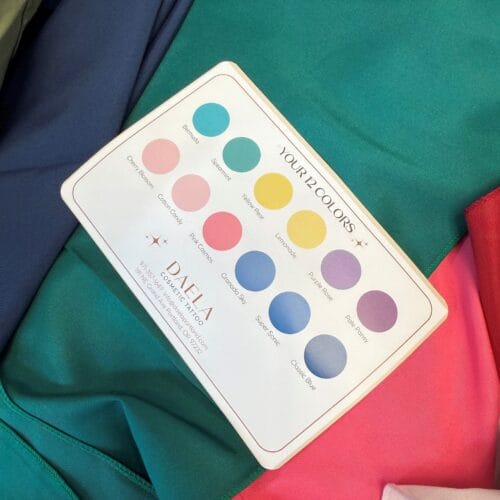
At DAELA, the appointment is 45 minutes and includes your personal seasonal color analysis along with guidance for clothing, lip and makeup colors, hair color and your overall palette. You’ll also leave with seasonal color reference cards you can actually take shopping with you.
Mostly, I want you to leave understanding your colors rather than memorizing a bunch of rules.
Because the next time you’re standing in a dressing room thinking, Why does this color look so much better on me than that one? you’ll have a pretty good idea.
Book Now! Seasonal Color Analysis with Shonna at DAELA Portland | 45 minutes | $185